
One product reference can support several visual directions. In this recorded Studio example, an amber perfume bottle becomes three independent posters: sunlit botanicals, white florals, and dark luxury.
This guide explains the prompts and results preserved in the perfume demo. The public workbench is a curated snapshot of the reference and outputs, with original prompt records. It is not a replay of an entire production session. The original prompts and the headlines in the artwork are in Chinese; this guide explains the process in English.
Start with the product details that should stay consistent
Open the example and compare its source image with the three outputs. The prompts identify four details to preserve: the amber glass bottle, black cylindrical cap, cream label, and bottle proportions.
For your own version, log in and copy the project, then supply your own product reference when starting a new task. A prompt asking for consistency is not a guarantee: compare the generated shape, cap, label, and reflections against the source before using an image.
Give each direction a distinct scene
The recorded prompts describe more than a mood. They specify the surface, light, palette, product placement, and headline area for each poster.
| Direction | Scene and light | Composition |
|---|---|---|
| Sunlit botanicals | Beige stone, golden side light, leaf shadows, warm cream tones | Bottle in the lower half, clear space for the headline above |
| White florals | White jasmine, green leaves, pale stone, soft daylight | A quiet cream background and generous space around the product |
| Dark luxury | Burgundy velvet and silk, low-key side light, subtle rim light | Dark surroundings, warm white or gold lettering above the bottle |
Generate each direction as an independent result and retain the earlier images for comparison. The second and third recorded prompts explicitly ask not to overwrite existing results. Open Task history in the demo to read the complete original requests instead of treating the English summaries here as the submitted prompts.
Inspect the actual outputs
The images below are the saved Studio outputs from this example, reused from the existing verified example asset catalog.
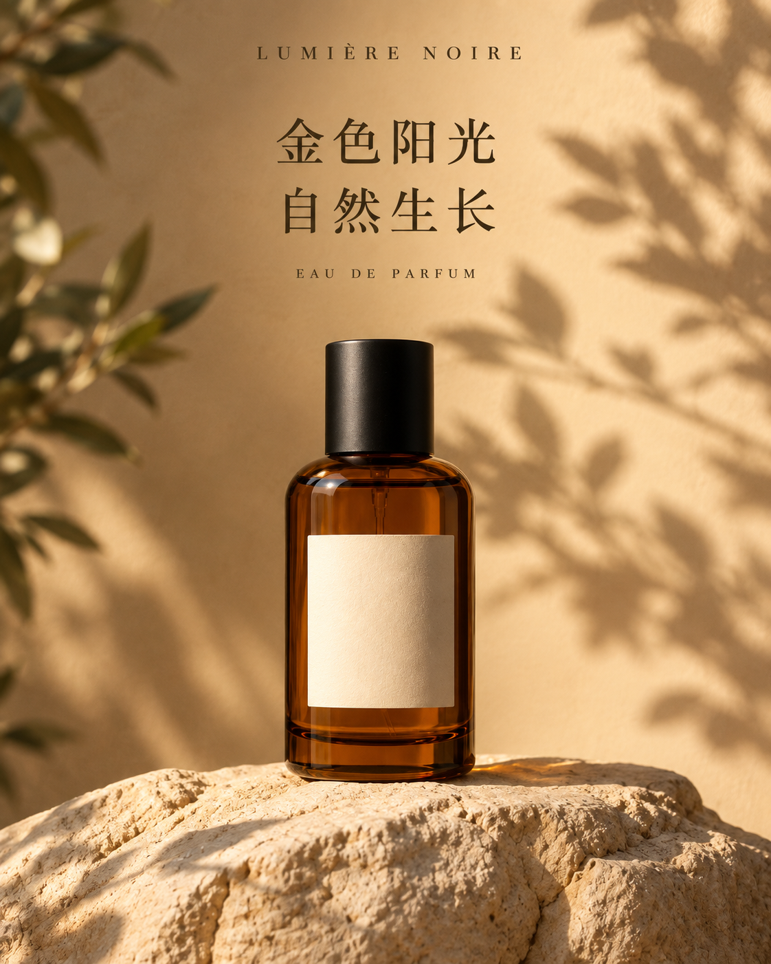
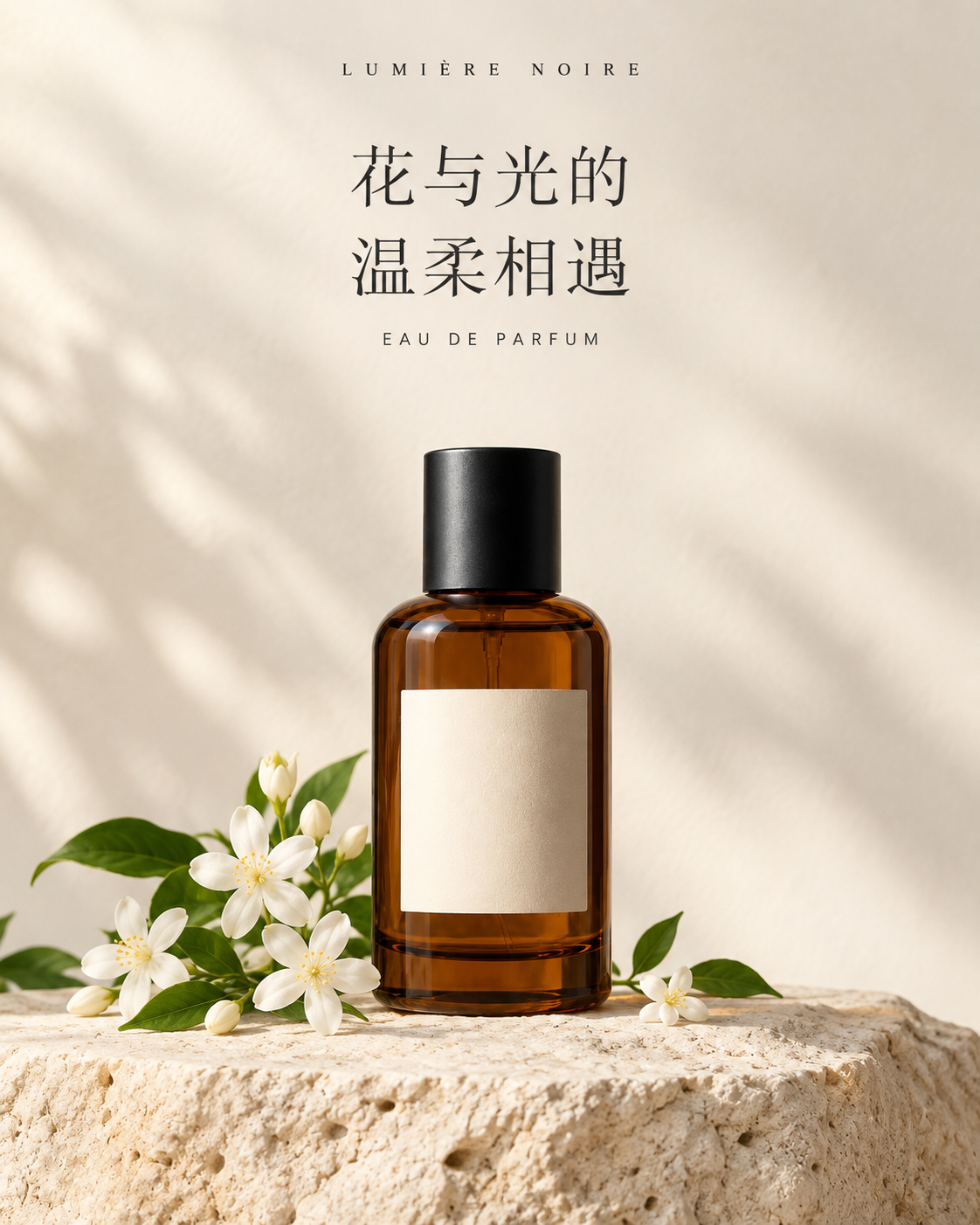
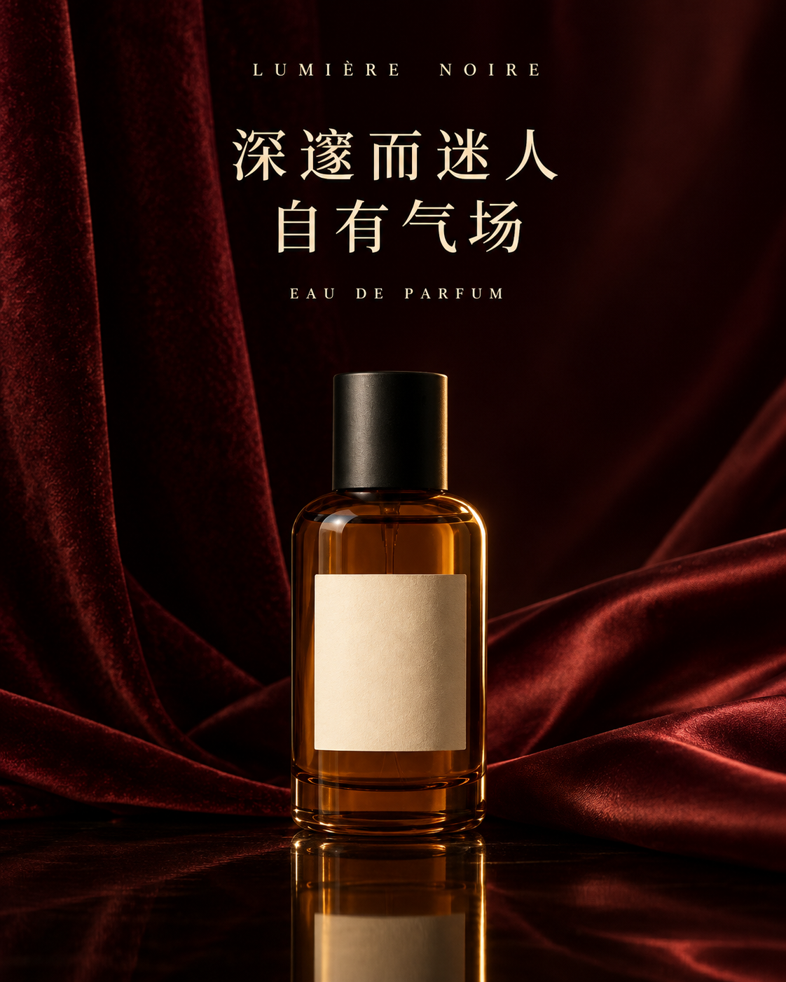
Compare them side by side in the workbench. Choose based on the intended placement and message: the background, product visibility, contrast, and reading order should work together. This example contains no advertising performance data, so it does not establish which direction would convert best.
Check dimensions and typography before exporting
The saved outputs are 1122 × 1402 pixels. The white-floral prompt initially requested 4:5 and includes a follow-up accepting the available portrait setting. Inspect the actual output dimensions rather than relying on a ratio mentioned in a prompt.
The poster lettering is part of each generated image. It is not evidence of separately editable text layers. To change the copy reliably, plan a background with room for your own text and follow the editable-text guide.
Before exporting, check:
- Bottle shape, cap, proportions, and label against the source.
- Every brand name, headline, and small line of text for errors.
- Contrast and headline readability at the final display size.
- The crop and dimensions needed by the destination placement.
Use the product-consistency checklist for a closer review and the PNG export guide when the composition is ready.
Continue with your own reference
Open the perfume example, inspect the original prompts, and log in to copy it. Replace the reference and copy with material you can use publicly, then generate and review your own variations. New generation tasks use your account’s applicable credits; consult pricing before starting.