
Open the coffee campaign demo to compare the reference and outputs and read the original task prompts.
A product launch usually needs more than one image. A wide website hero needs room for a headline; a portrait poster needs a different reading order; a square social post needs to work at a small size.
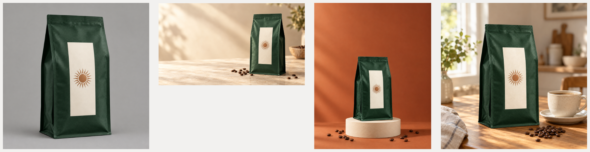
For this example, we created a fictional coffee package in CubbieAI Studio, then used that same reference for three separate generations. The source is an AI-generated concept, not a customer photograph or a real brand endorsement. Every image below was generated in the production Studio on September 16, 2026, and downloaded from its canvas.
1. Establish a simple product reference
The reference is a single forest-green coffee bag with a cream label and copper-colored sun symbol. Keeping the packaging free of text makes this an exercise in composition and visual consistency, rather than a test of generated label copy.
We selected GPT Image 2, 1K and a 1:1 ratio. The downloaded image is 1254 × 1254 pixels. The first attempt showed a timeout; after waiting and using the task’s retry control, Studio returned a completed result. This example does not promise a fixed generation time or a particular credit refund.
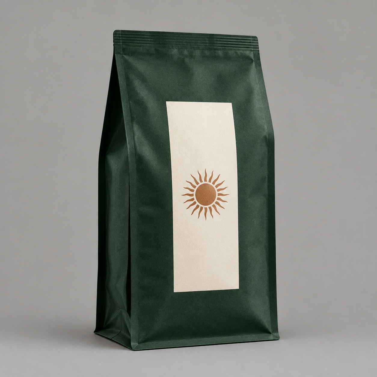
The actual reference prompt was:
生成一张虚构咖啡产品的棚拍参考图。单个哑光深森林绿自立咖啡袋,正面居中放置一块竖向奶油白标签,标签中部只有一个简洁的铜色圆形太阳图案,没有文字。直立、四分之三视角,完整展示包装顶封、侧边和袋底,包装占画面高度约七成。纯暖灰背景,柔和均匀光线,真实纸质细微纹理,清晰商品摄影。不要咖啡杯、道具、多余包装、水印或拼图,只生成一张图片。
2. Give each placement its own composition
Before each new task, we selected the original package image on the canvas. We did not use the previous scene as the next scene’s reference. This keeps the intended product reference clear and makes the differences easier to review.
| Output | Selected ratio | Actual downloaded size | Composition |
|---|---|---|---|
| Website hero | 16:9 | 1672 × 941 | Product on the right, open space on the left |
| Poster background | 4:5 | 1122 × 1402 | Product and plinth below a clear title area |
| Social image | 1:1 | 1254 × 1254 | Package and coffee cup in a morning setting |
All three tasks used GPT Image 2 at the Studio’s 1K setting. The pixel dimensions are measured from the downloaded files; the setting does not mean every image has a side of exactly 1024 pixels.
Landscape: leave room for the message
We asked for a pale stone surface, warm morning light, a few coffee beans and the product on the right. The result provides a quiet left-hand area for future copy.
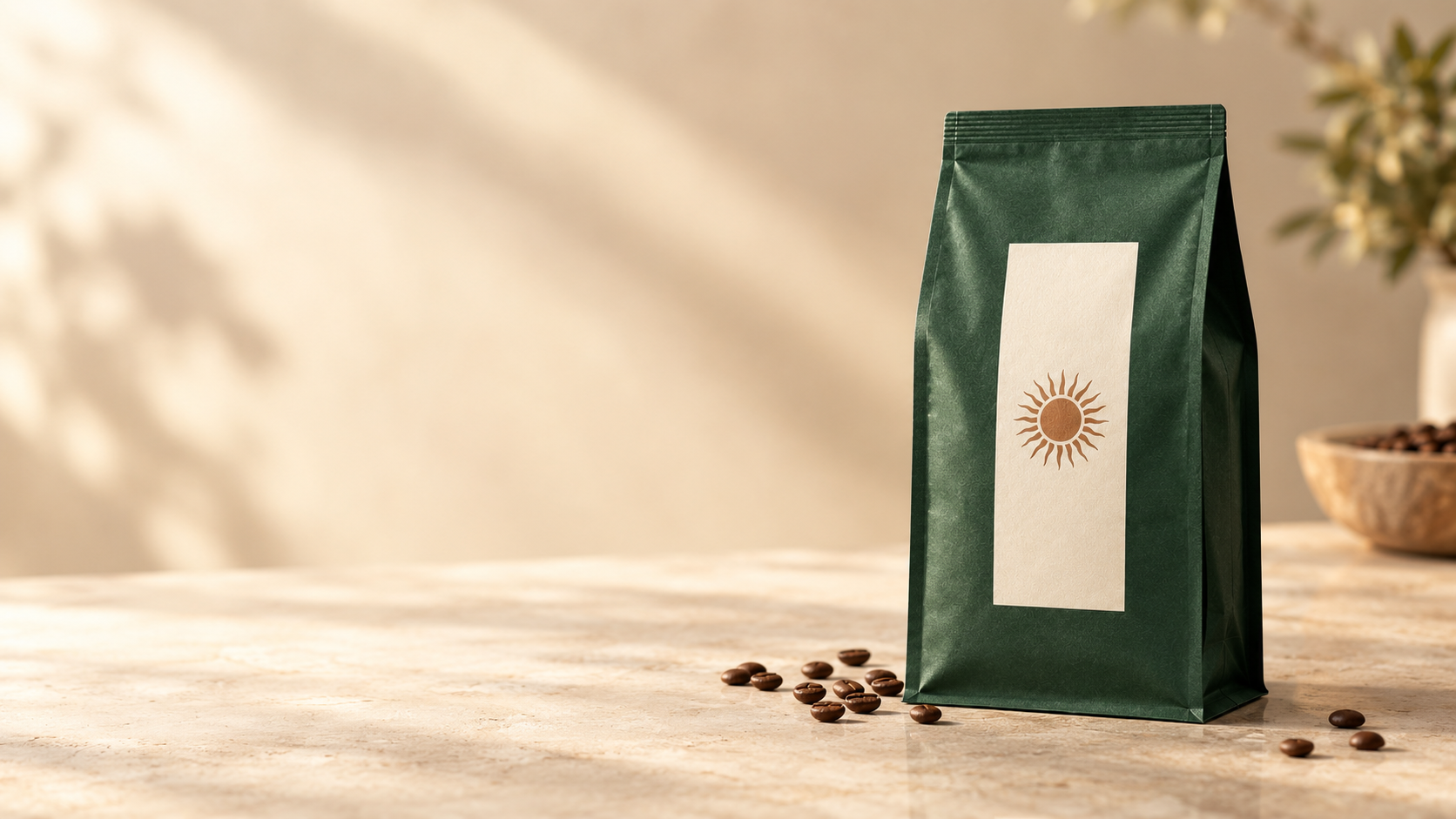
Actual submitted prompt:
使用参考图中的同一款咖啡包装,保持深森林绿色、奶油白标签、铜色太阳图案、袋形和封口一致。制作横向咖啡新品主视觉,包装放在画面右侧,浅米色石材桌面,左侧自然晨光,少量咖啡豆,温暖安静的精品咖啡氛围。左侧留出干净的浅色区域供后续排版。商品完整清晰,不增加品牌、文字、包装或水印,只生成一张图片。
Portrait: make space for a headline
The portrait direction changes the palette to terracotta and raises the package on a pale plinth. It is a poster background, with no headline, price or offer added. A finished promotional poster still needs approved copy and a typography pass.
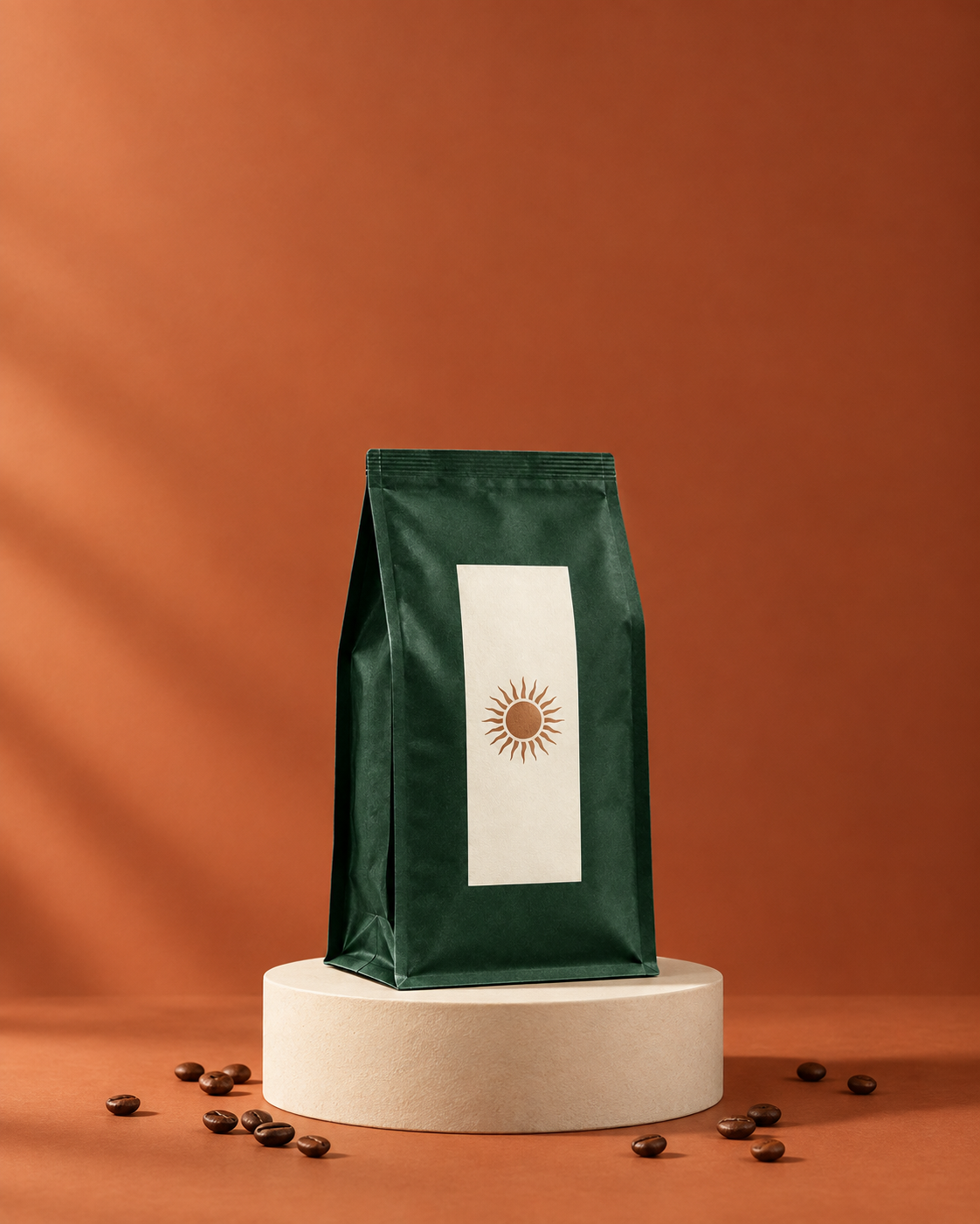
Actual submitted prompt:
使用参考图中的同一款咖啡包装,严格保留袋形、深森林绿色、奶油白标签和铜色太阳图案。制作竖向新品发布海报底图,包装置于下半部中央的浅色圆柱台座上,陶土色背景,柔和但鲜明的侧光,少量咖啡豆作为点缀,上半部留出足够干净空间供后续添加标题。画面简洁,商品轮廓完整,不生成任何文字、折扣数字、额外包装或水印,只生成一张图片。
Square: show the product in a daily ritual
For social media, we asked for a warm wooden table and a cream coffee cup. The image gives the package a recognizable everyday context while keeping it prominent.
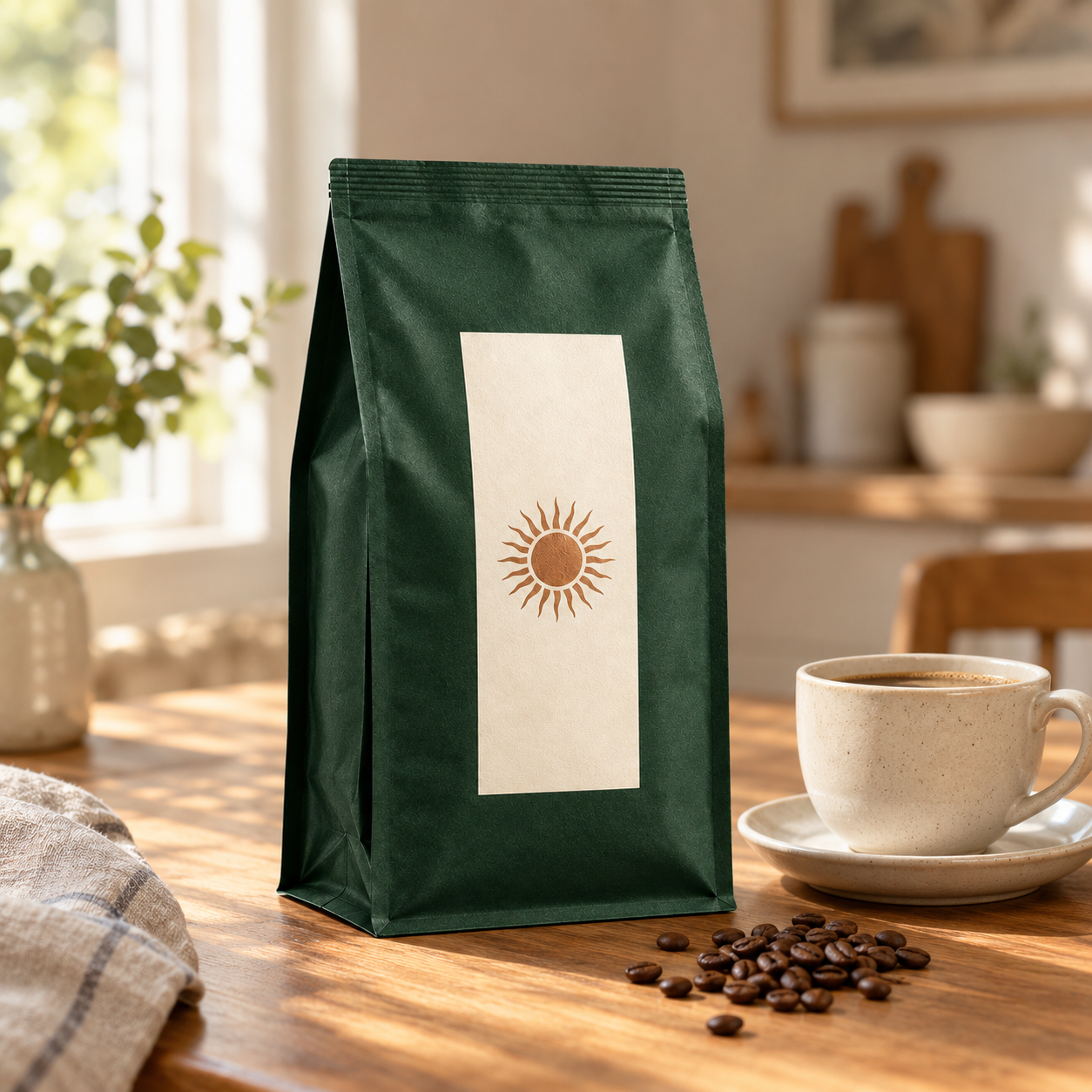
Actual submitted prompt:
使用参考图中的同一款咖啡包装,保持包装形状、深森林绿色、奶油白标签和铜色太阳图案一致。制作方形社媒新品配图,咖啡包装为主角,放在温暖的木质咖啡桌上,旁边一只无标志的奶油色咖啡杯,柔和窗影和少量咖啡豆,日常清晨场景。包装正面清楚可见,四周留安全边距,背景不抢主体。不生成文字、额外包装、水印或拼图,只生成一张图片。
3. Compare details before calling the assets finished
The green bag, cream label and sun symbol are recognizable across the set. They are not identical copies. The landscape image shows the opposite side of the bag, and the sun’s rays vary between images. A prompt requesting consistency does not guarantee an exact product match.
For a real product launch, compare the seal, proportions, label placement, logo and printed claims with the approved product image. Correct any mismatch before publication. Also check crops and text contrast at the intended display size. This concept example contains no advertising performance data.
4. Keep source files separate from the overview
After generation, we moved the four images into a row in the Studio canvas and exported a 2017 × 520 overview. No image pixels were manually edited and no editable text layers were added in this recorded run.
Use that overview to explain the process. Use the individual PNG downloads for production: they preserve each image’s original dimensions. Keep the reference, prompts, output sizes and review notes together so another designer or video editor can understand how the set was made.
This workflow is a starting point for a launch kit: establish one reference, choose a composition for each placement, compare the results and finish the copy and layout for the channel you actually need.